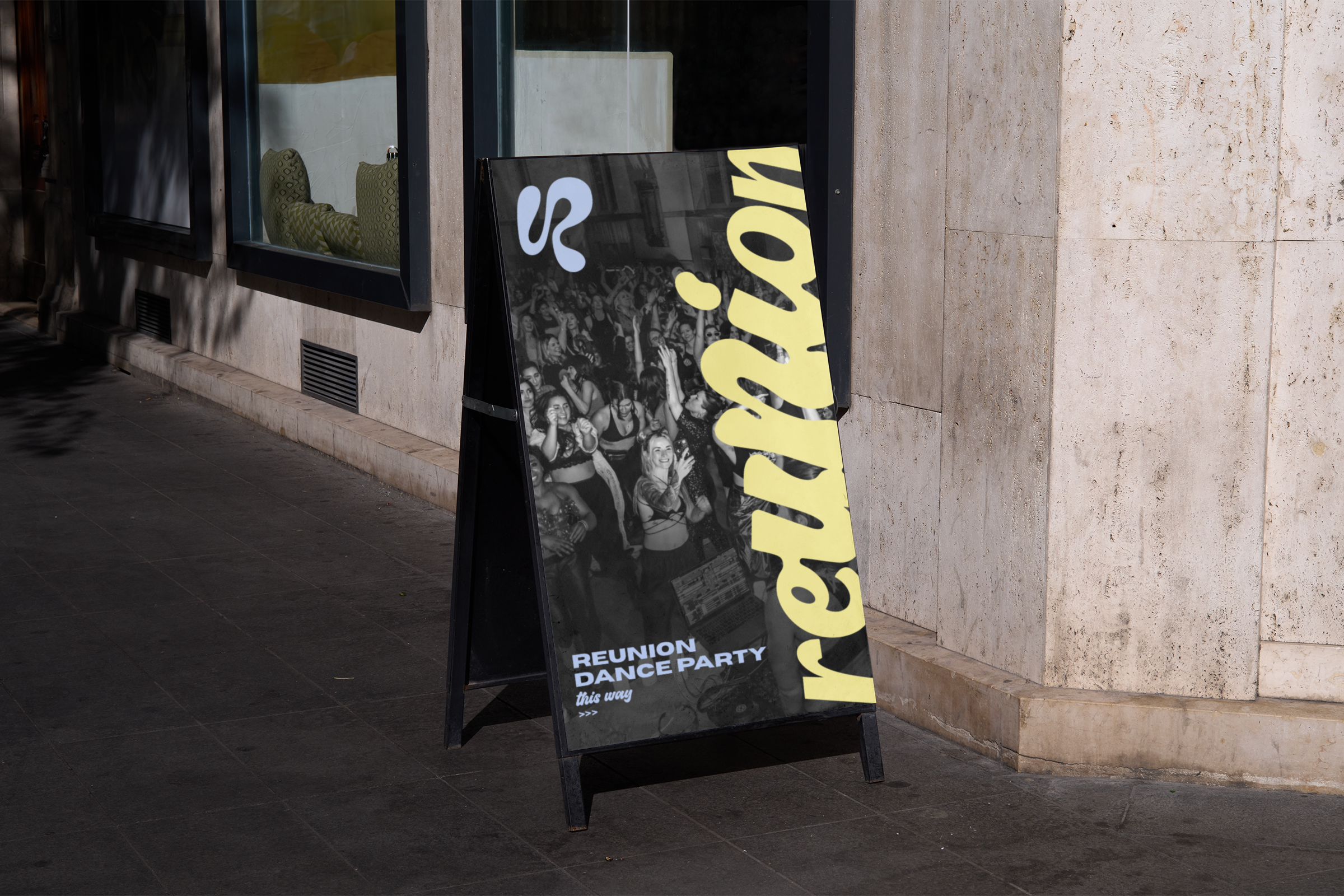
REUNION
DANCE PARTY


✹
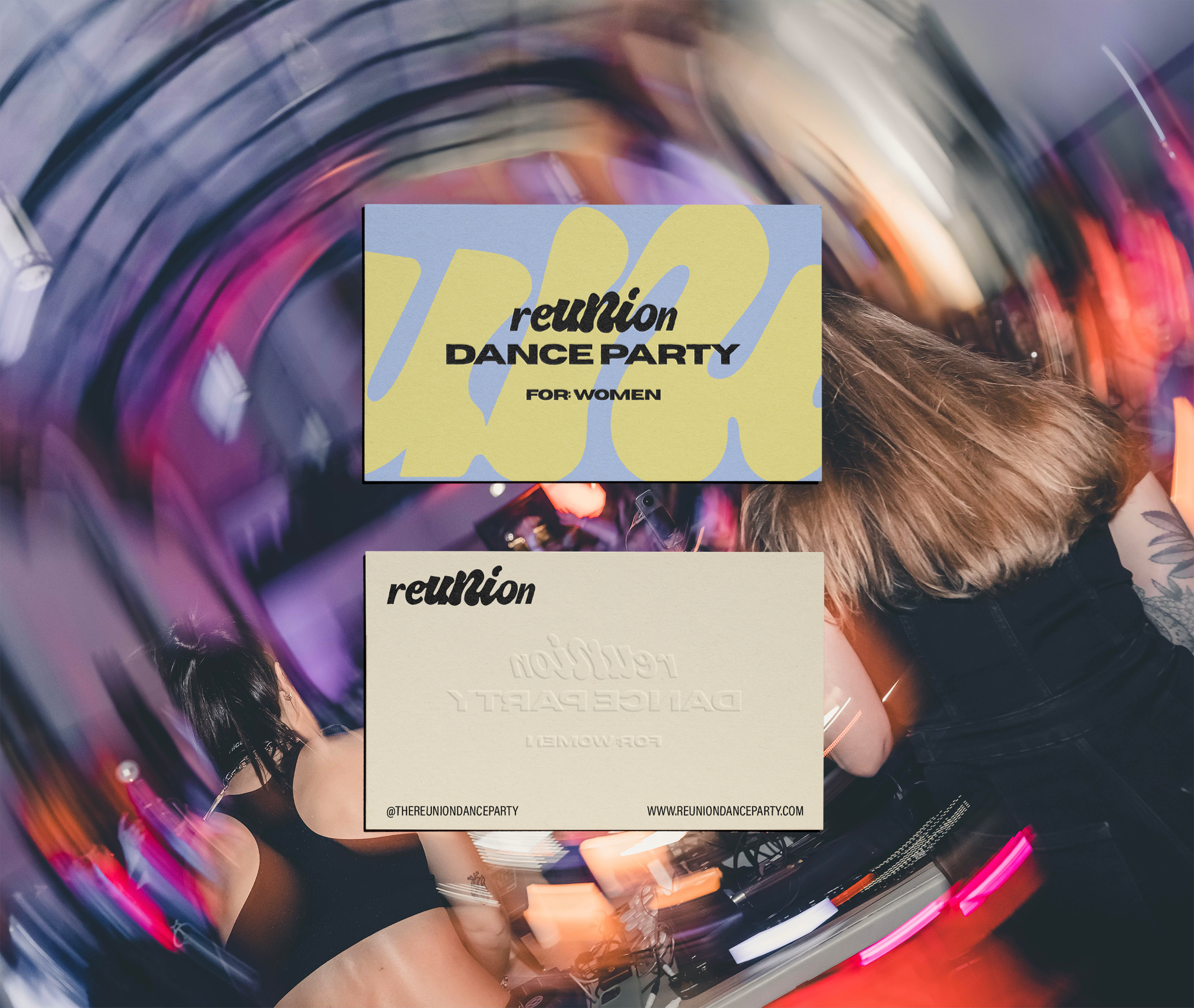
We partnered with REUNION to build a bold and expressive brand identity for their alcohol-free, women-only dance rave—launching at their GRAVE RAVE Halloween event.
Designed as a transformative alternative to traditional nightlife, REUNION guides women through grounding, playful expression, release, and meditation—all before 11pm. To reflect this intentional journey, we developed a dynamic logo suite that visually represents expansion and return, moving from simple and grounded to playful and expressive, then back to refined and structured.
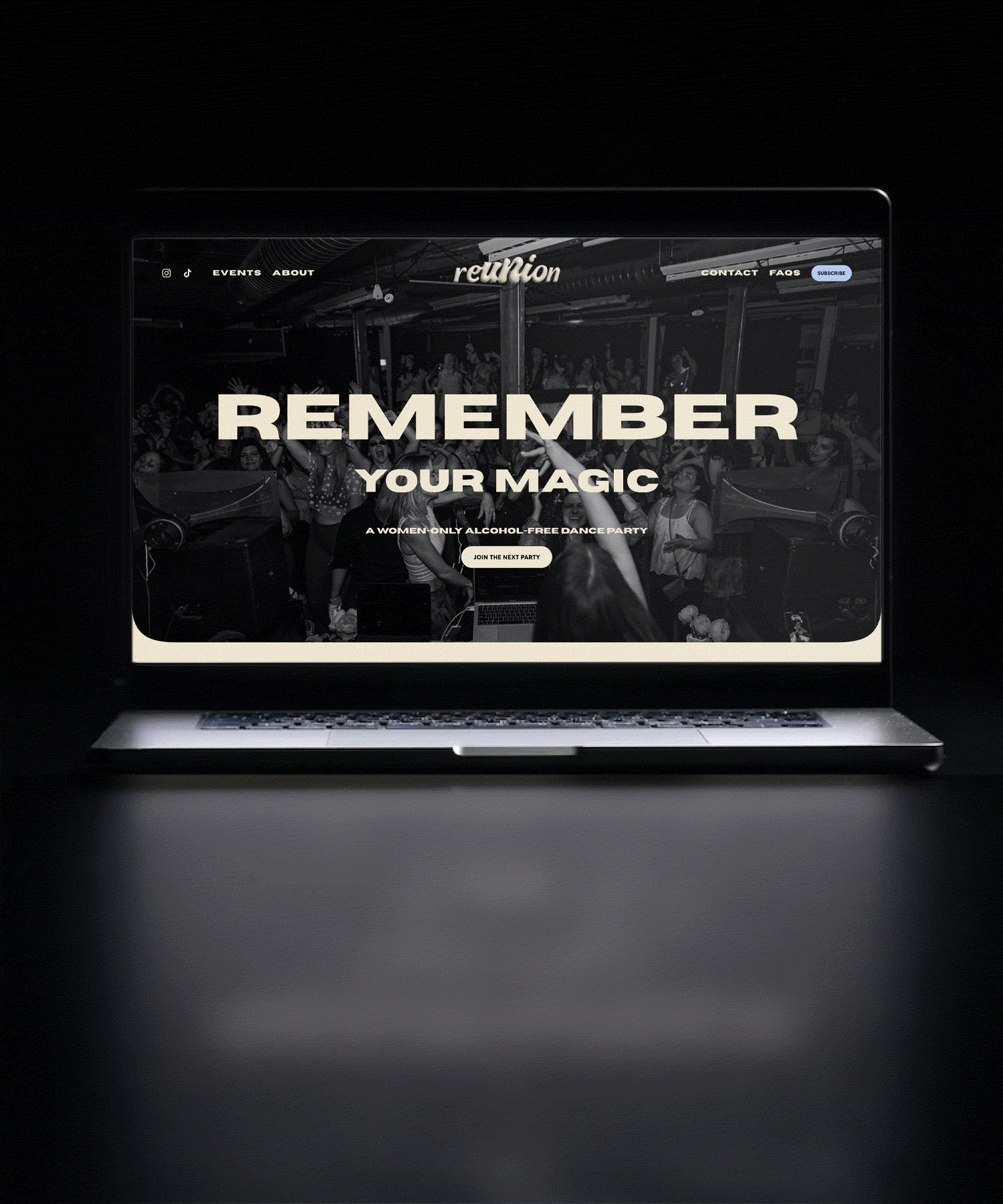
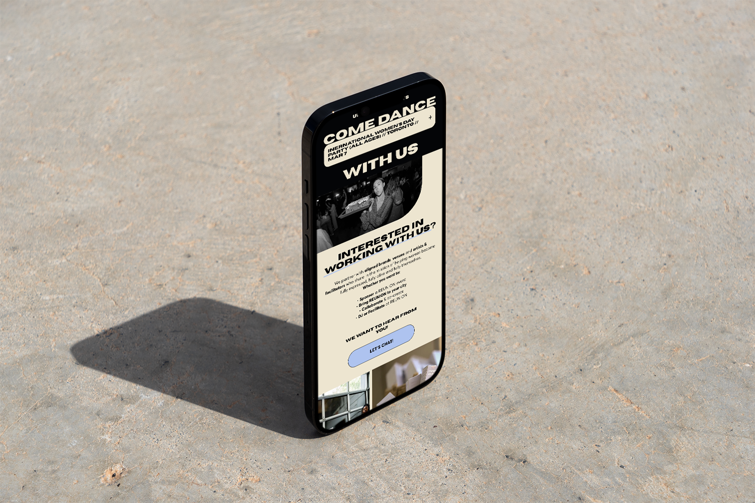
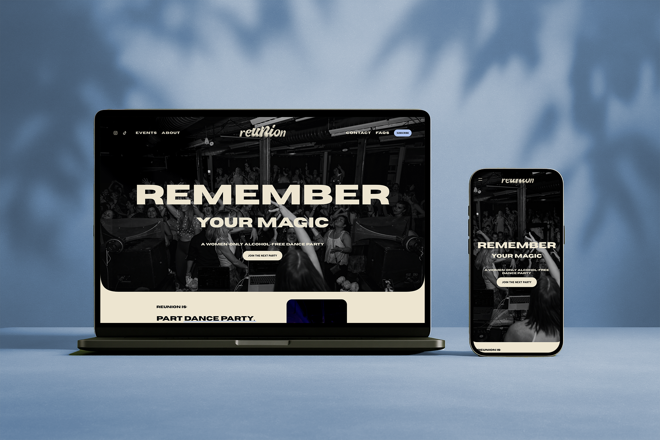
Alongside the Quickie Brand build, we designed a streamlined one-page Quickie Web with a dedicated contact page to clearly communicate their mission and invite women into the movement.
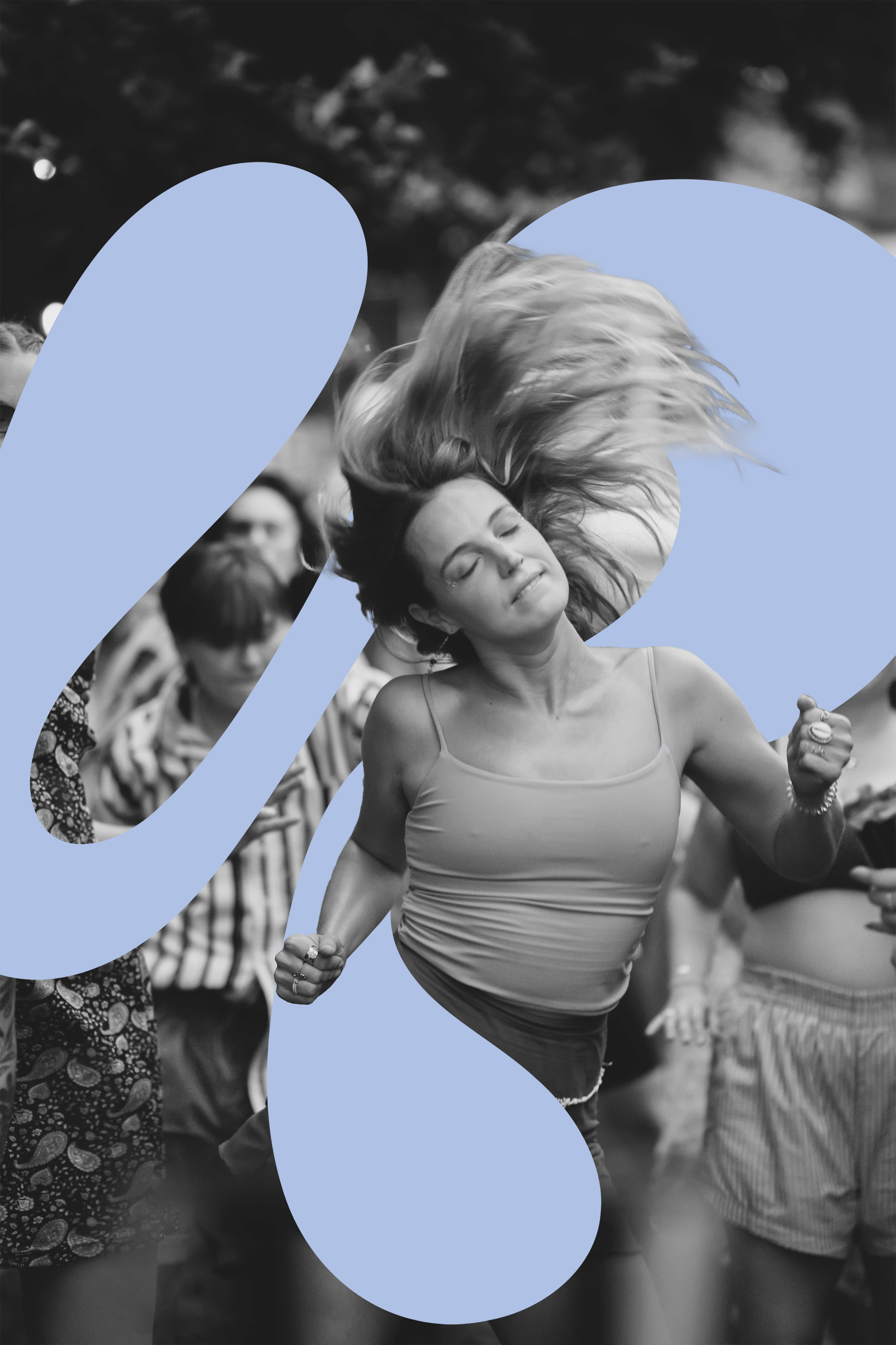
The result is a brand that feels electric yet intentional—capturing the collective feminine energy of the dance floor while honouring rest, wellness, and connection.
SERVICES DELIVERED:
QUICKIE BRAND QUICKIE WEBSITE PATTERNS
BRAND OVERVIEW
BRAND PERSONALITY
01.
Transformative, expressive, and grounded. The REUNION brand is playful and a little funky, yet deeply intentional — balancing high-vibe feminine energy with softness and structure. She’s the fun friend who gets you out on that dance floor, making you feel safe, comfortable and at home in yourself.
TARGET AUDIENCE
02.
Women seeking connection, release, and community without the pressure of alcohol culture and the male gaze, allowing themselves to fully let go and be in the moment, deeply.
Those craving a joyful, bad ass, embodied night out that still honours rest, wellness, and collective feminine energy.
To build a recognizable movement that redefines what a “night out” can look like — alcohol-free, intentional, and community-driven. Building a brand experience that mirrors the emotional arc of the event itself and the awakening that women walk away with: grounding, expansion, release, return and growth.
03.
BRAND GOALS