

DOUBLE ZERO
ART INC.


✹
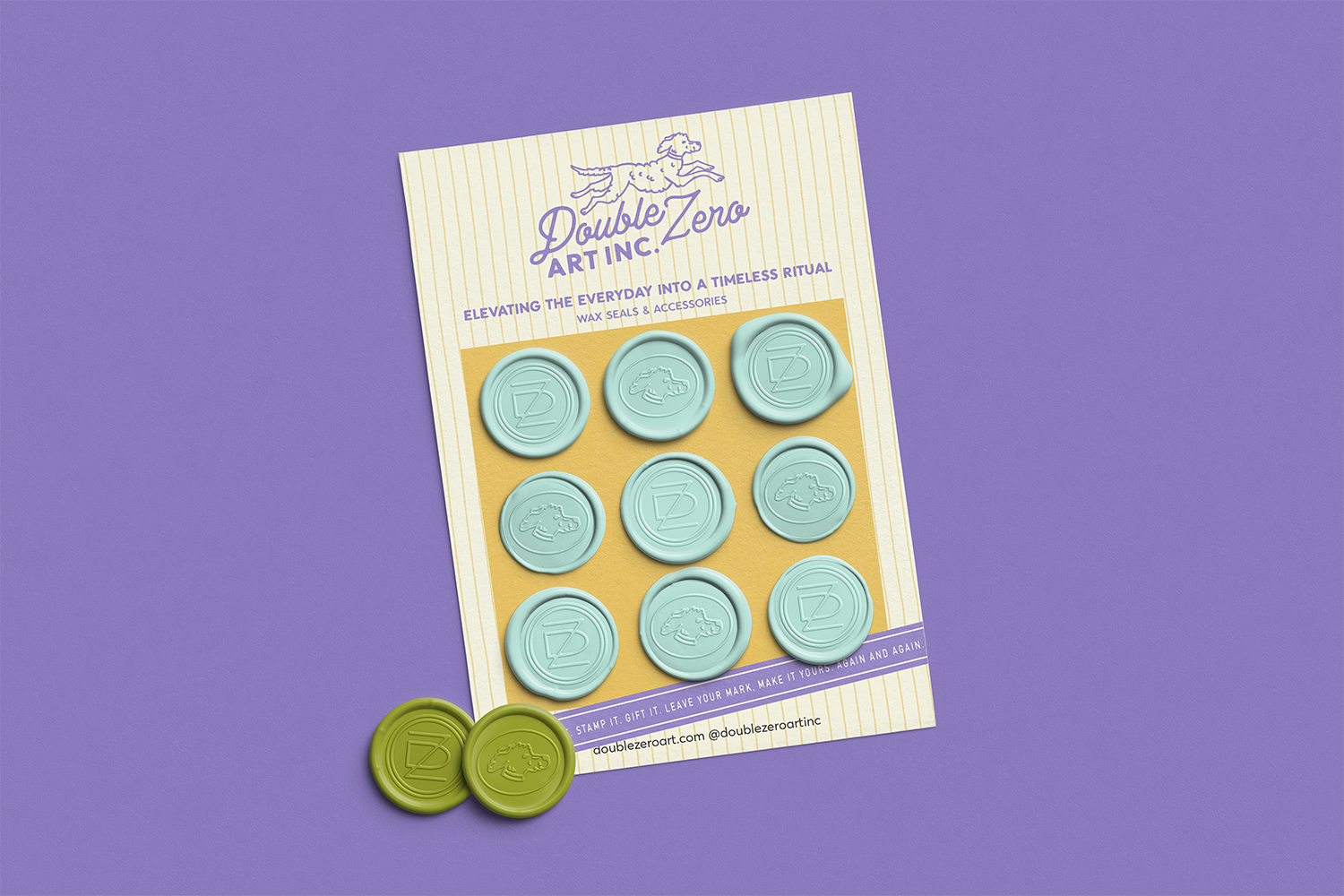
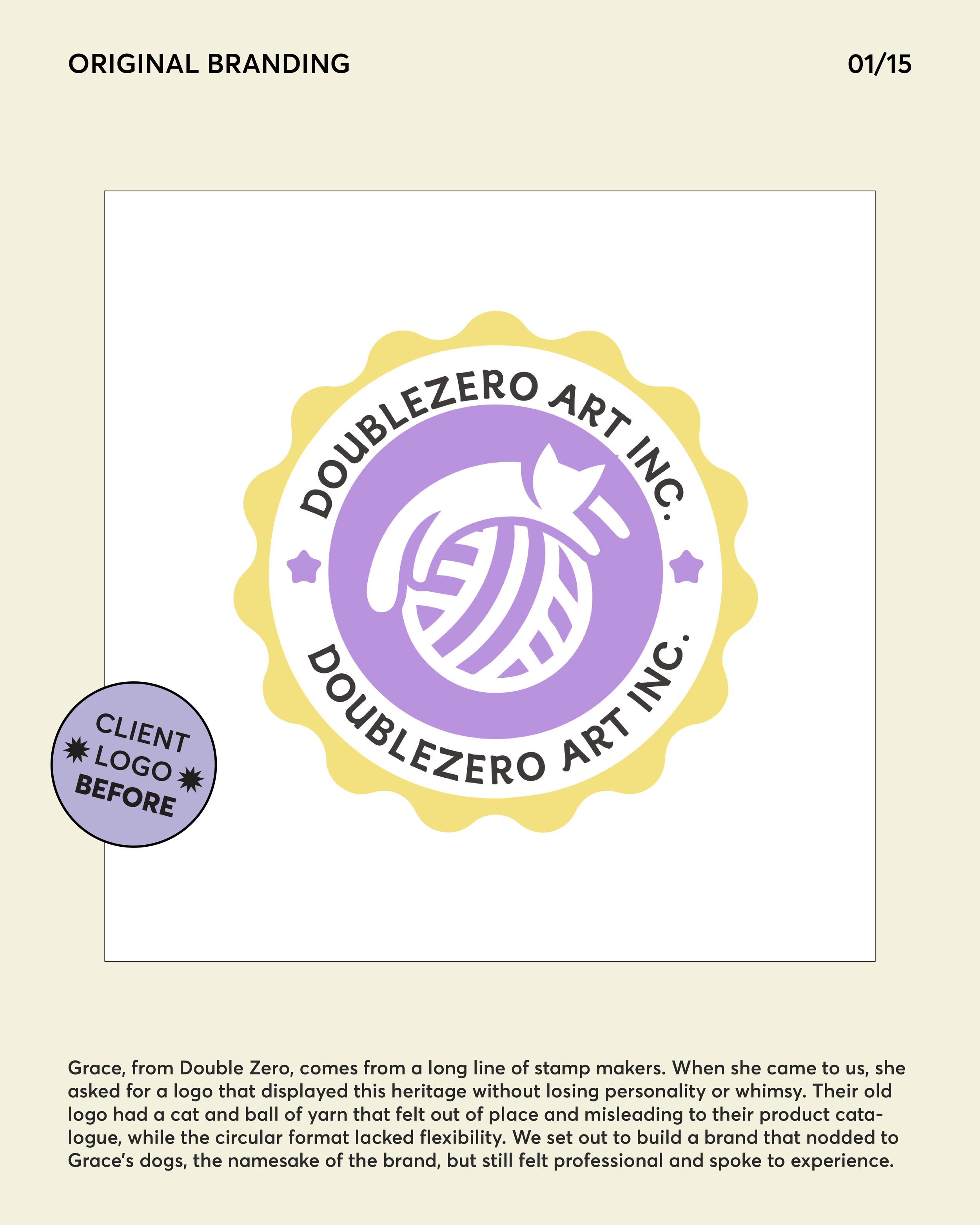
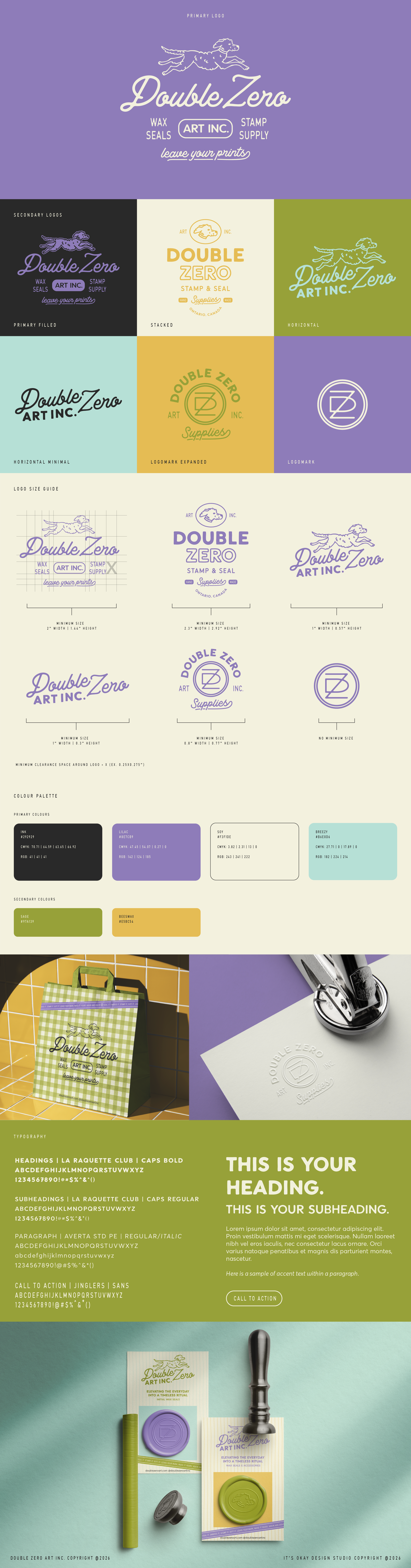
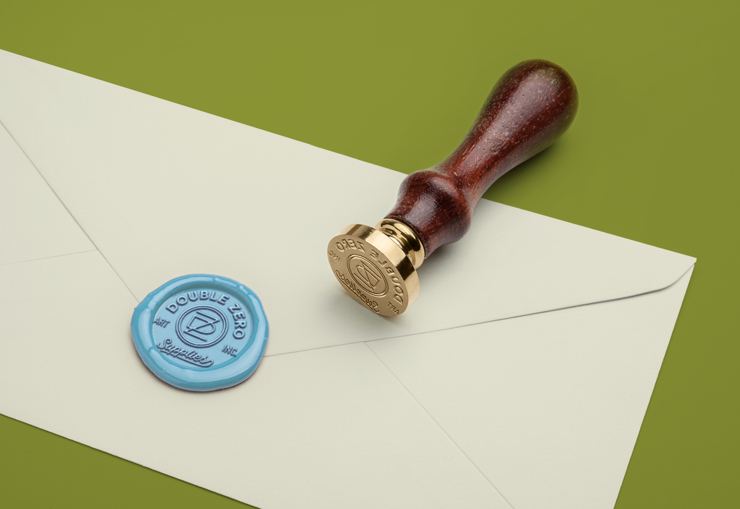
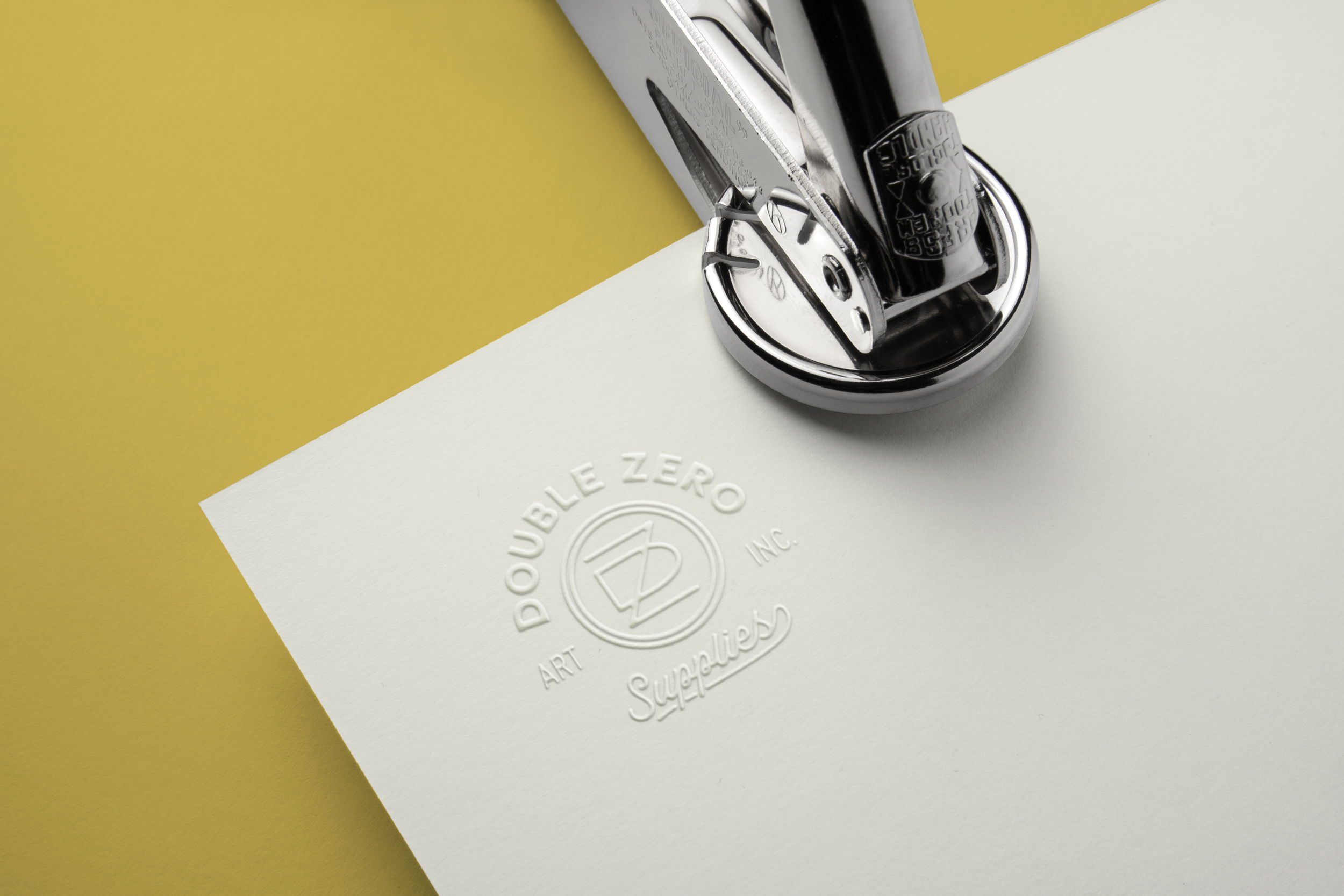
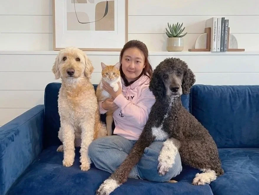
For our client Grace, the owner of Double Zero Art Inc., we built a brand that feels like a cozy, well-loved print shop: rooted in tradition, full of personality, and still a little bit playful. Her family has been making stamps for generations, and her old logo wasn’t telling that story. We moved the brand from bright and cute to classic and warm, while keeping a nod to her two poodles, Double and Zero, who inspired the name. The result is a cohesive identity that balances heritage and charm, mirroring the care and human touch behind every custom stamp, wax seal and embosser she makes.
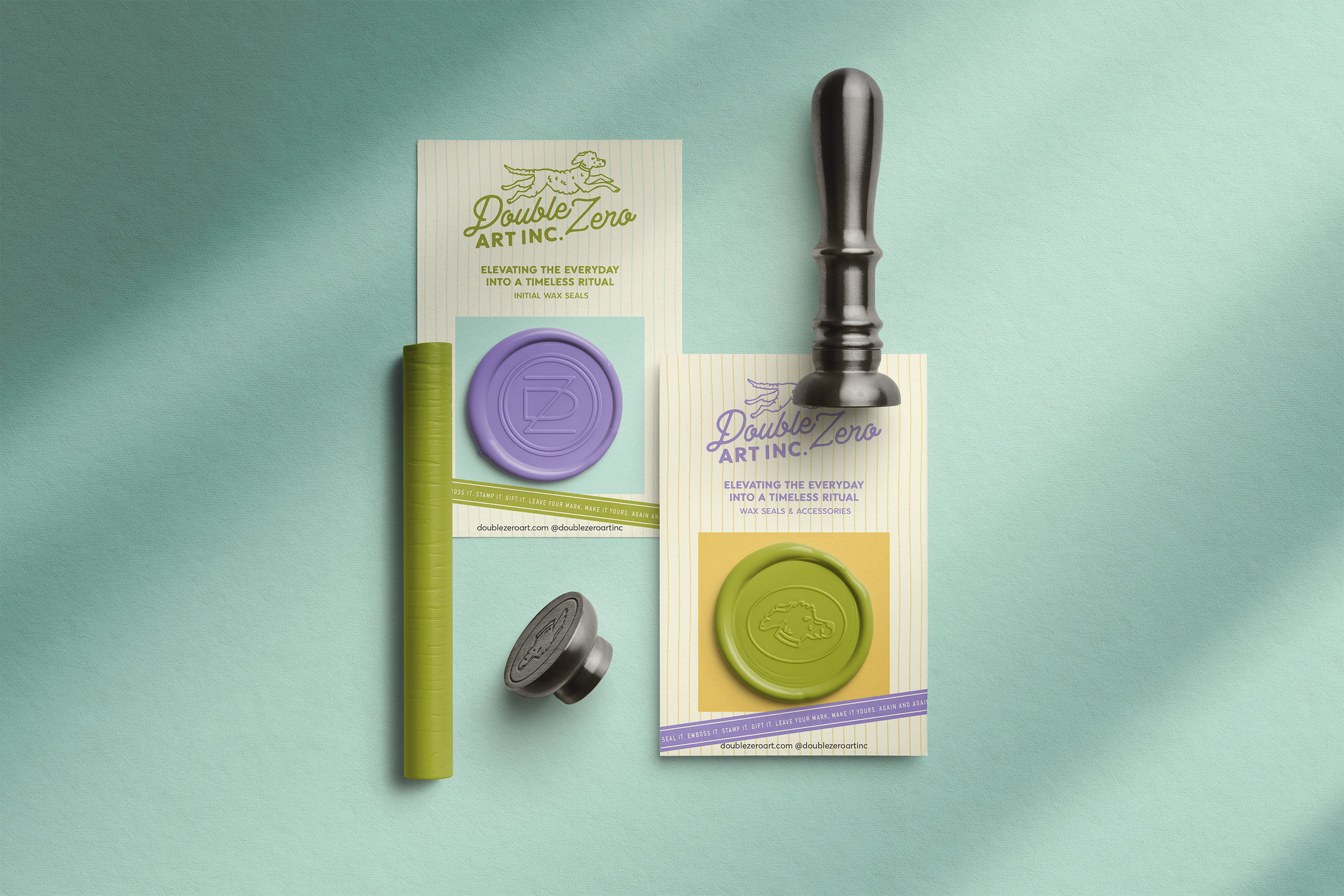
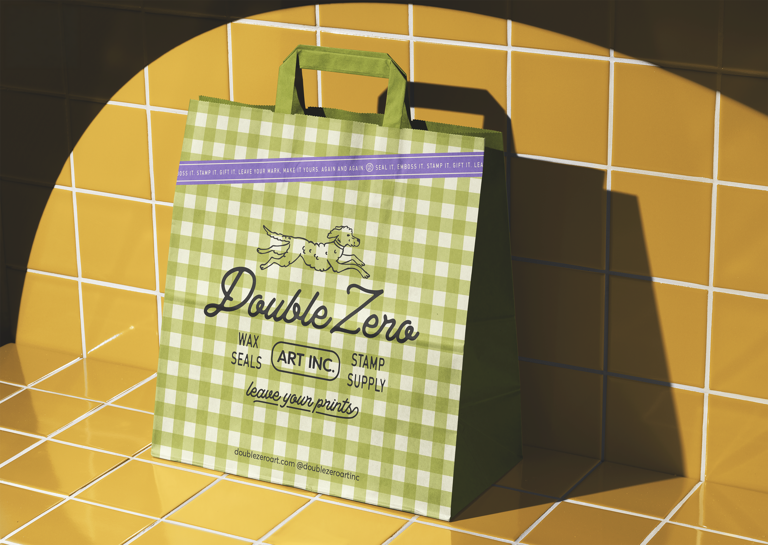
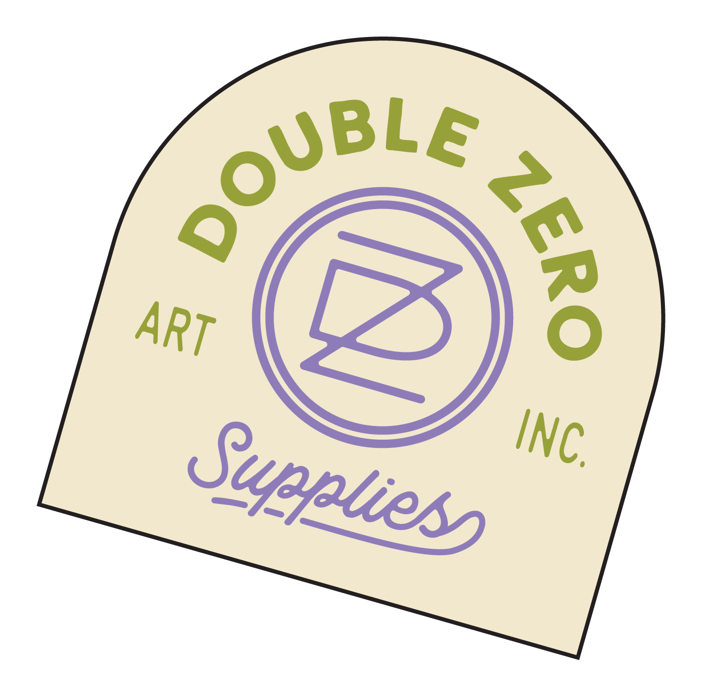
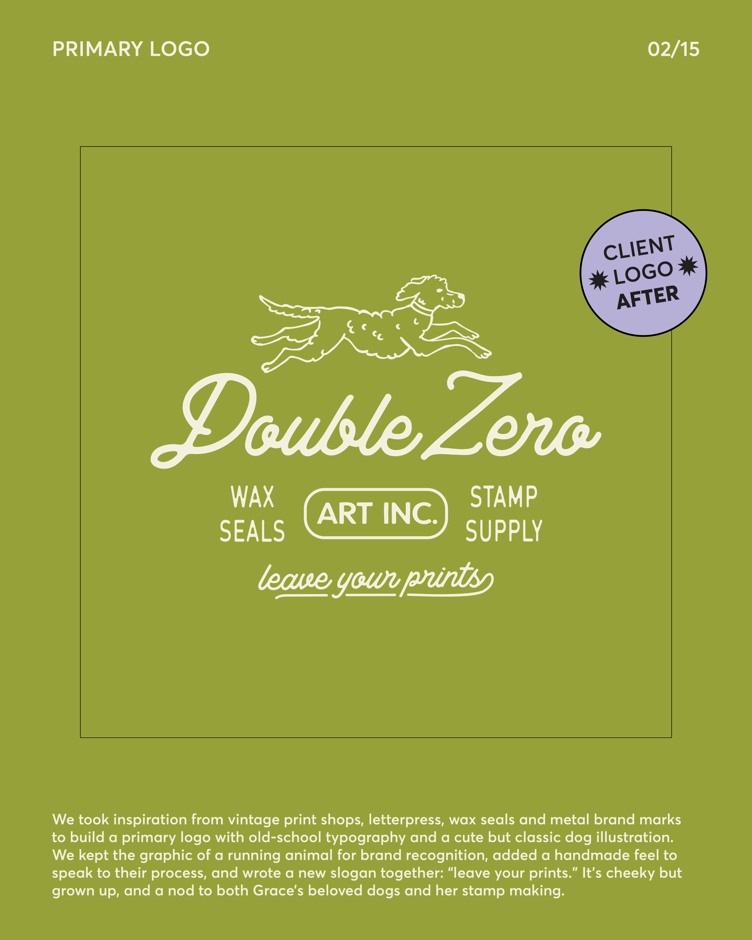
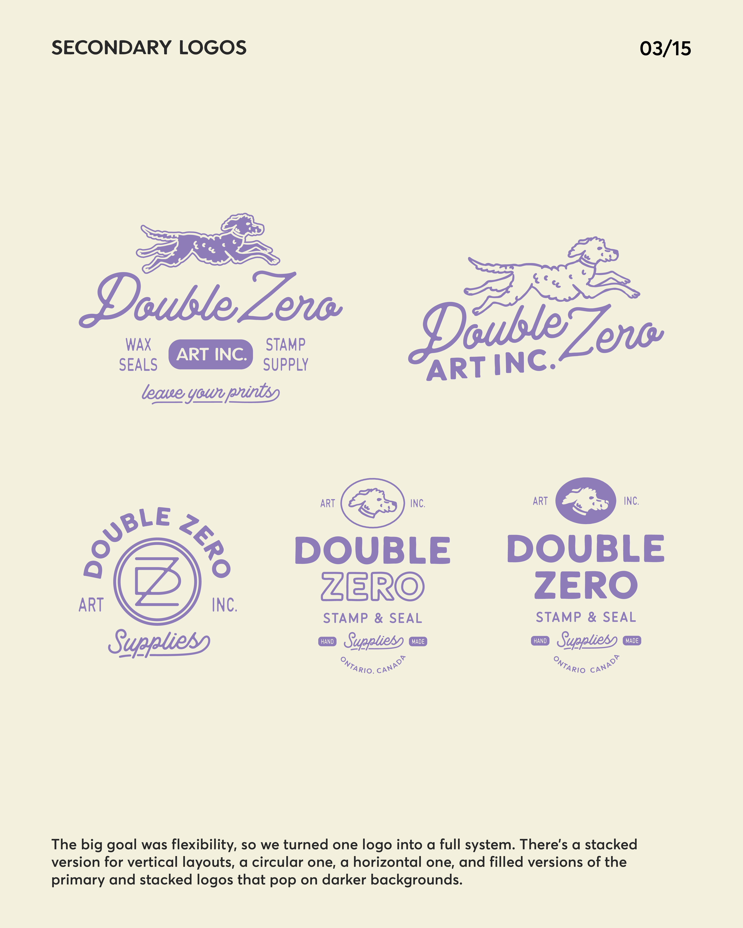
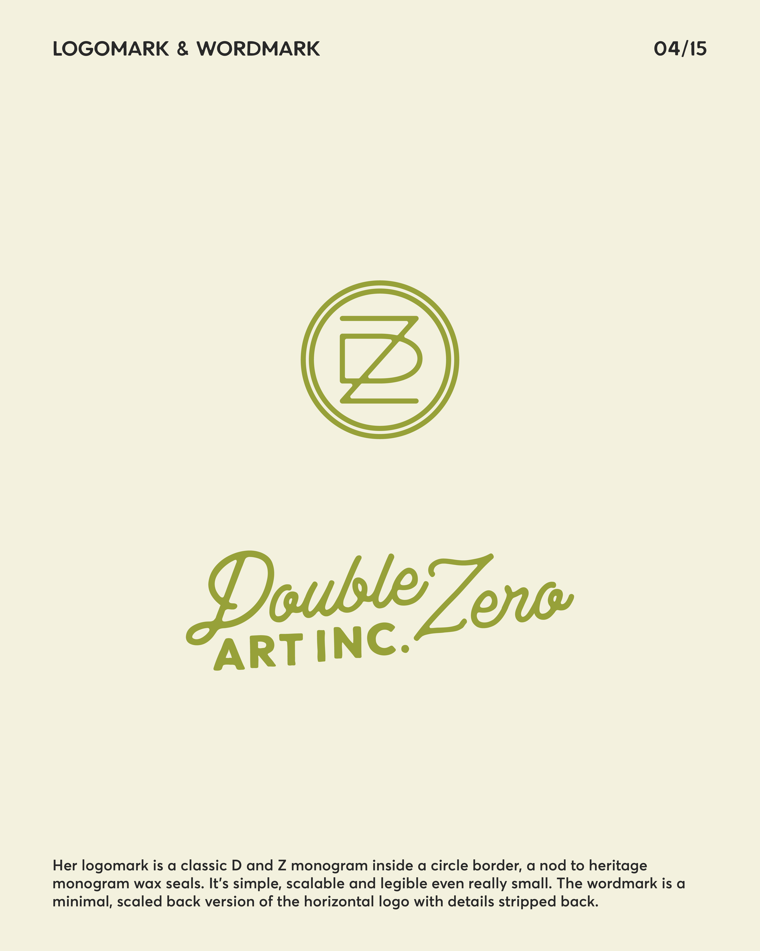
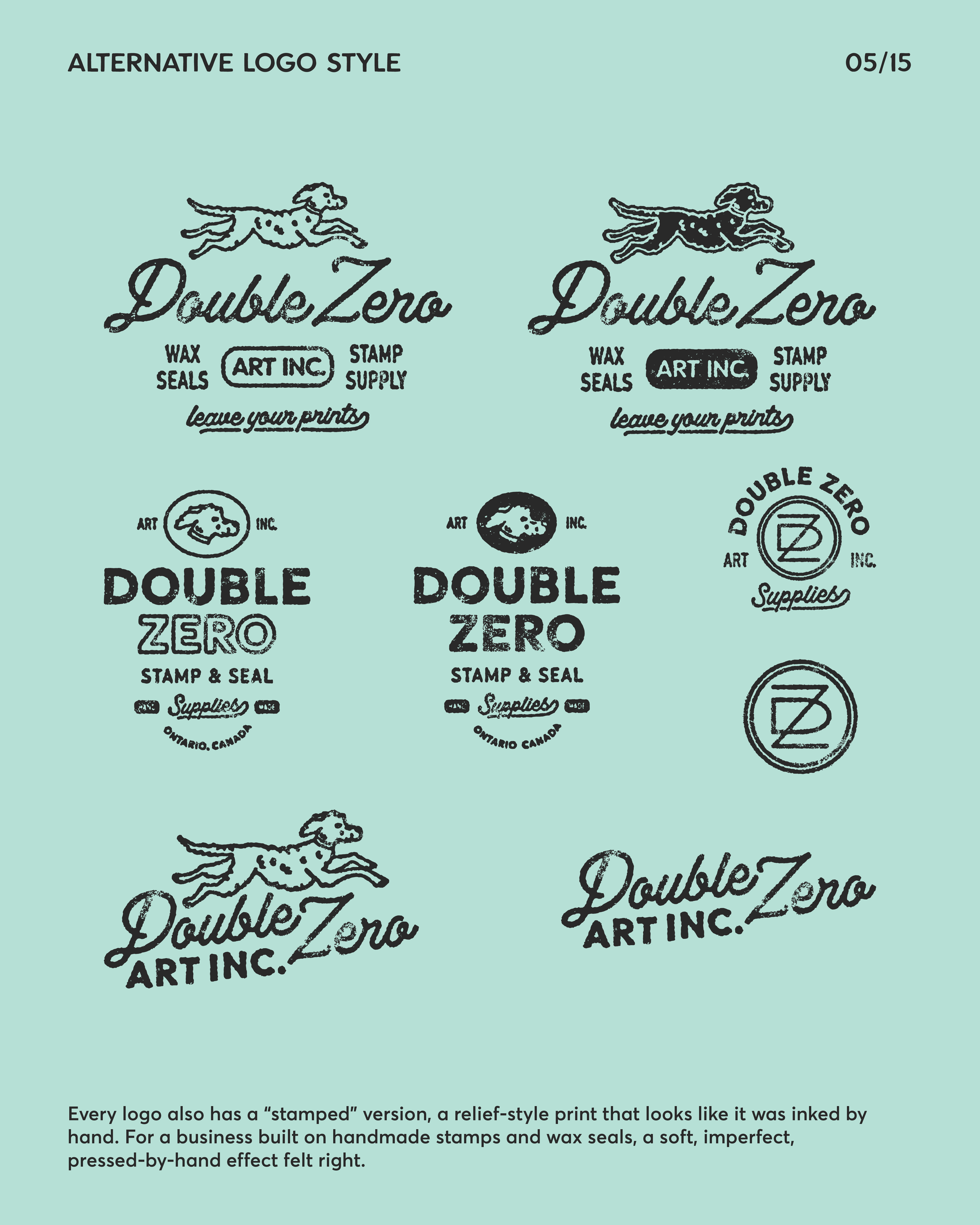
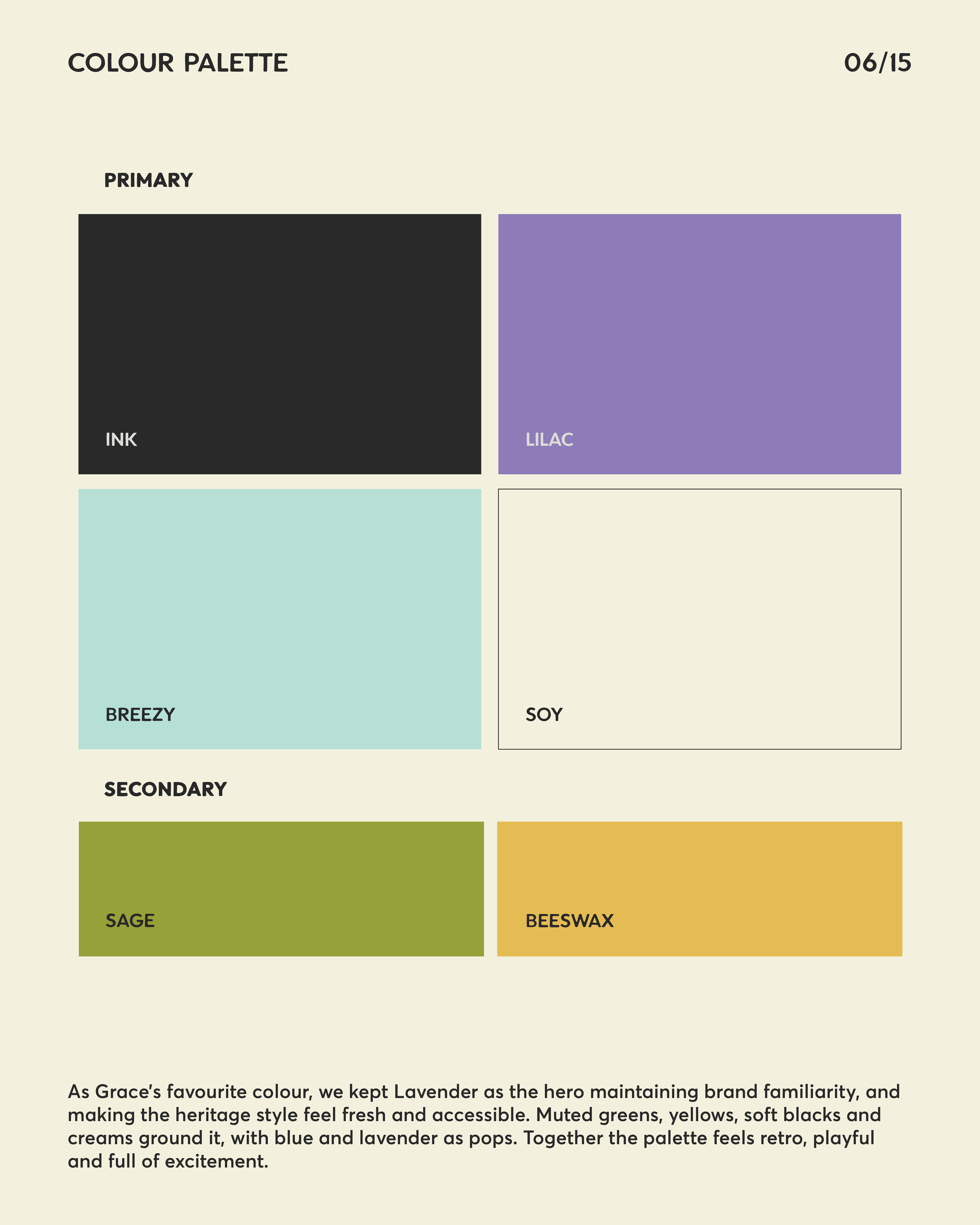
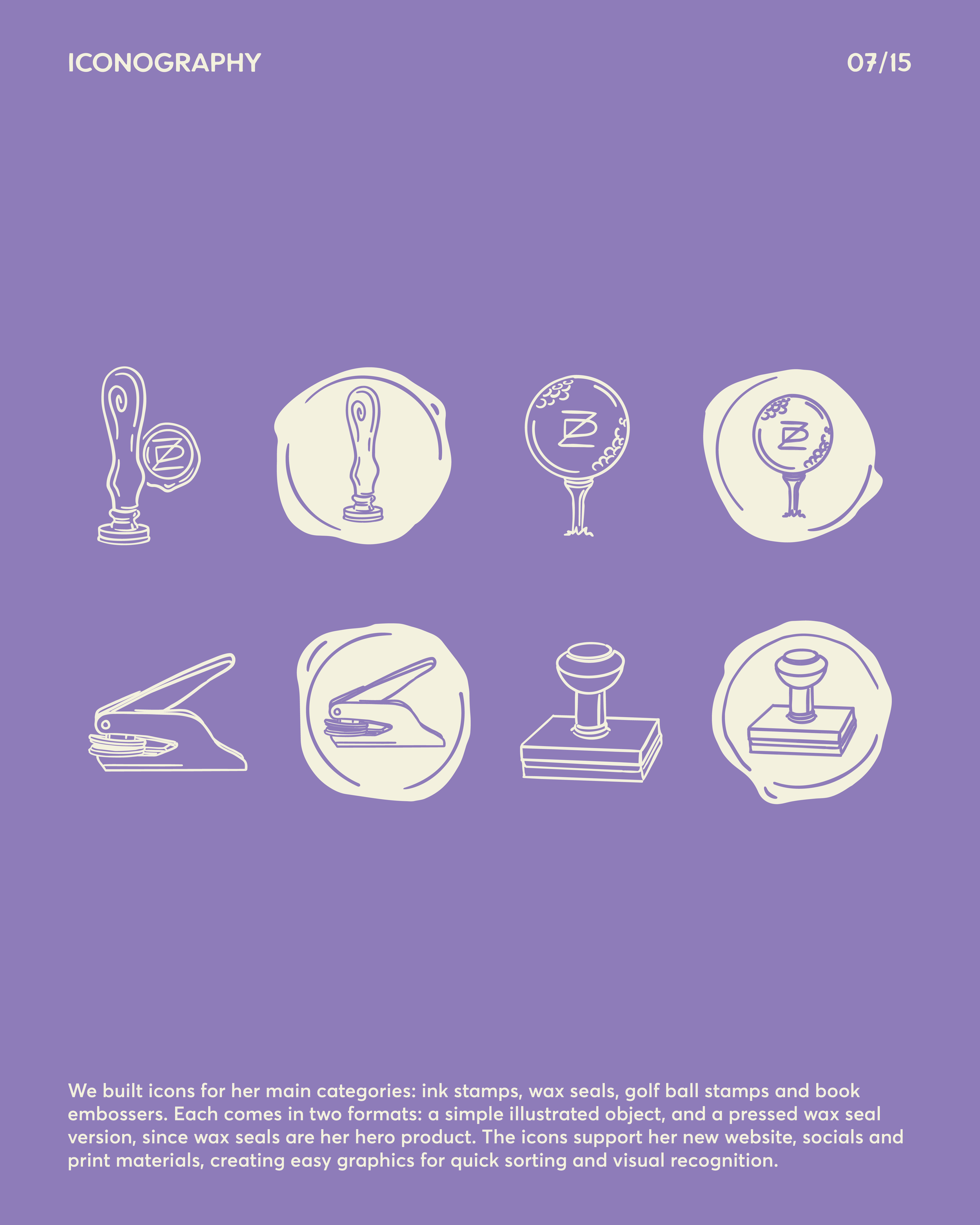
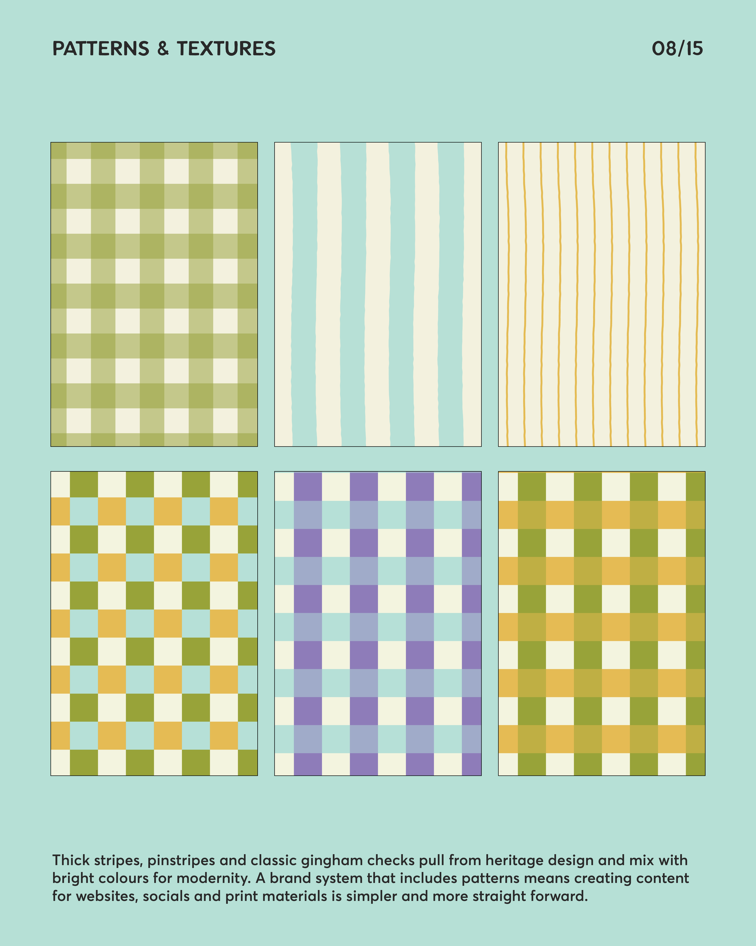
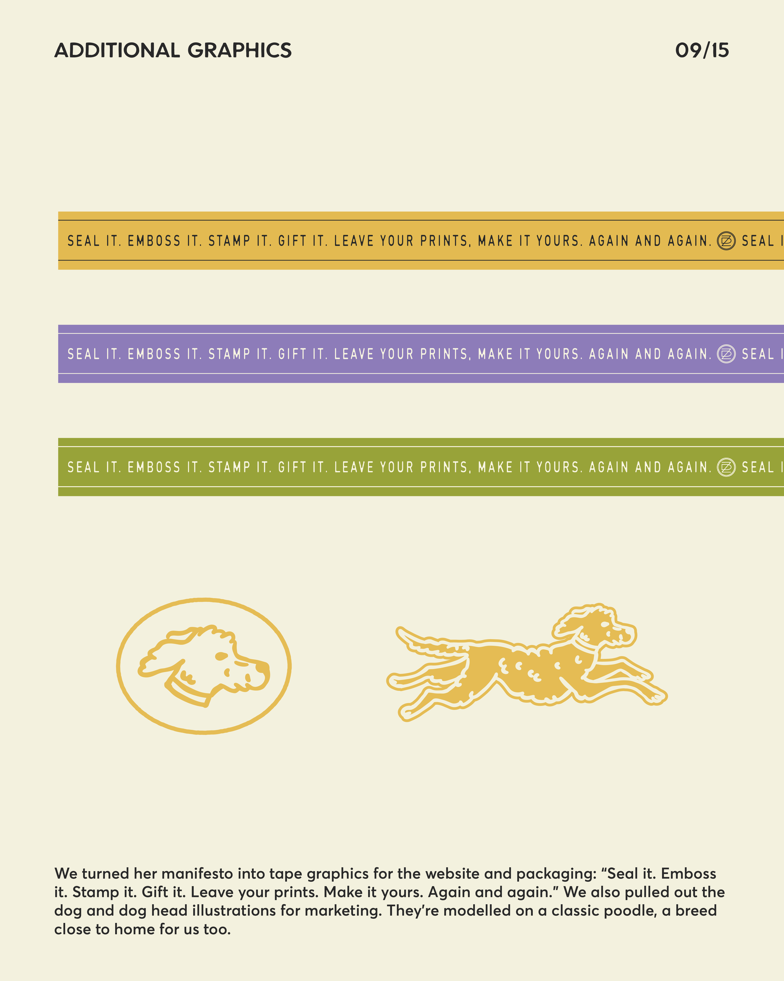
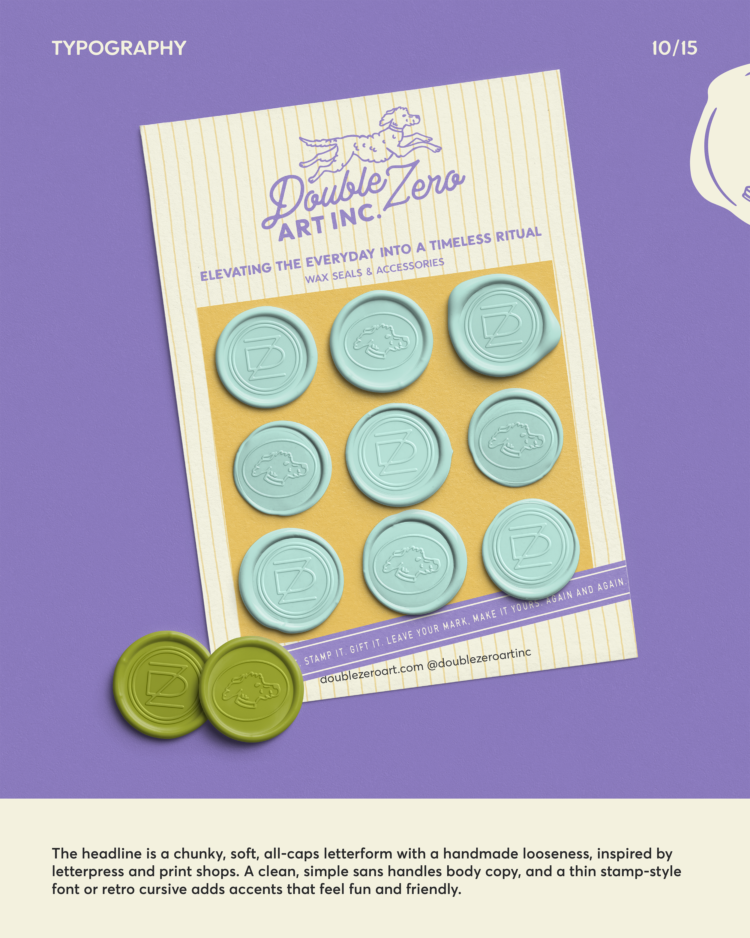
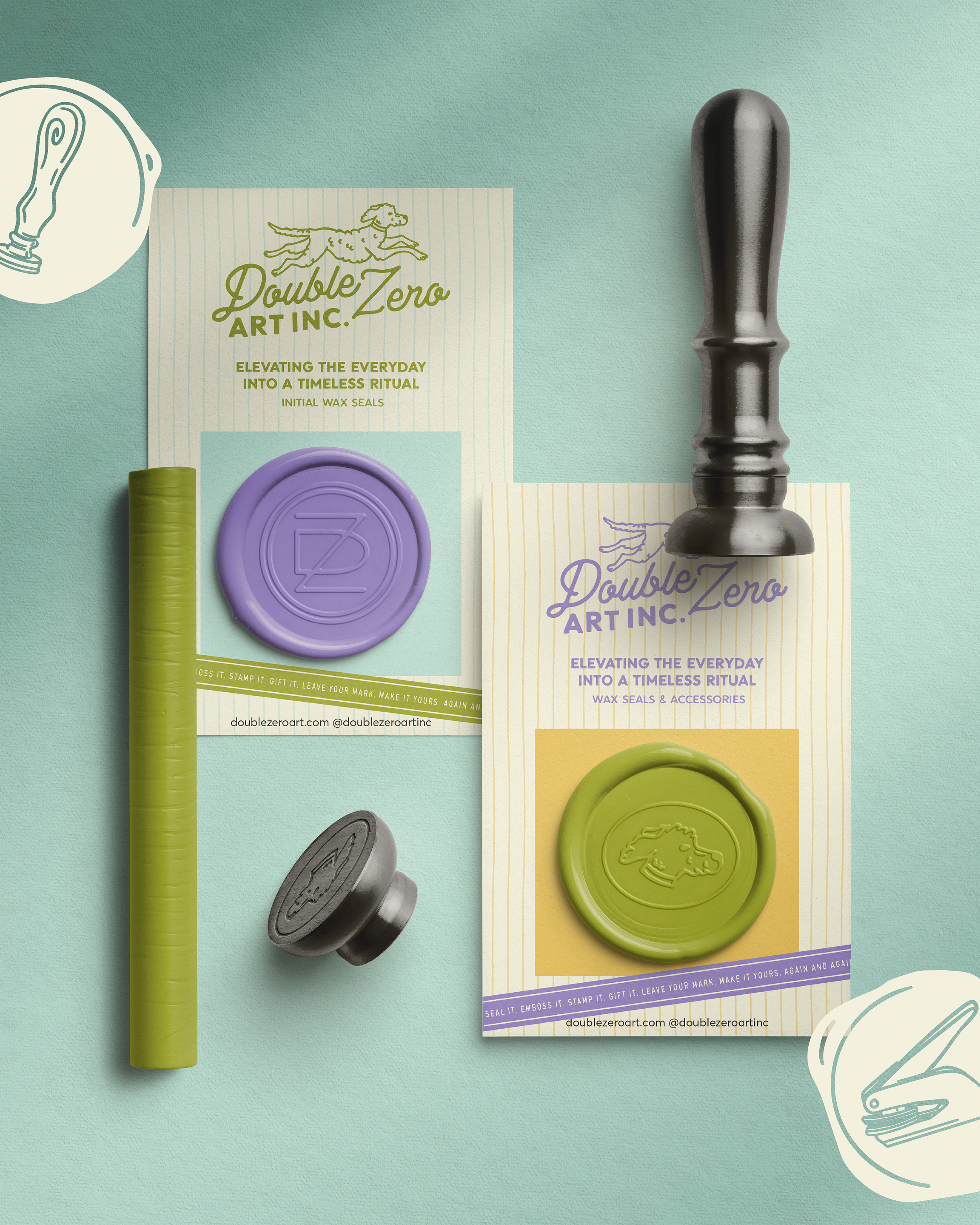
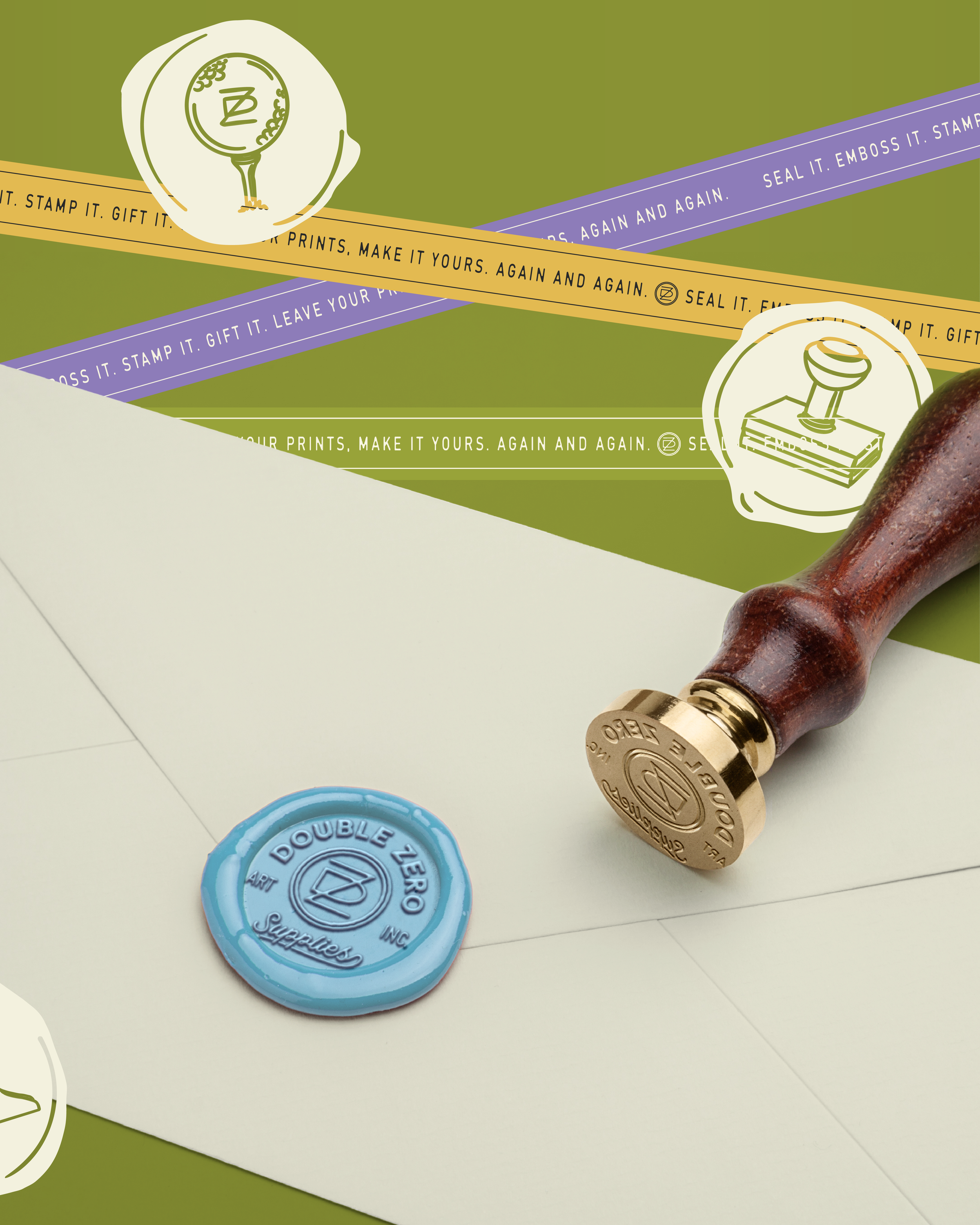
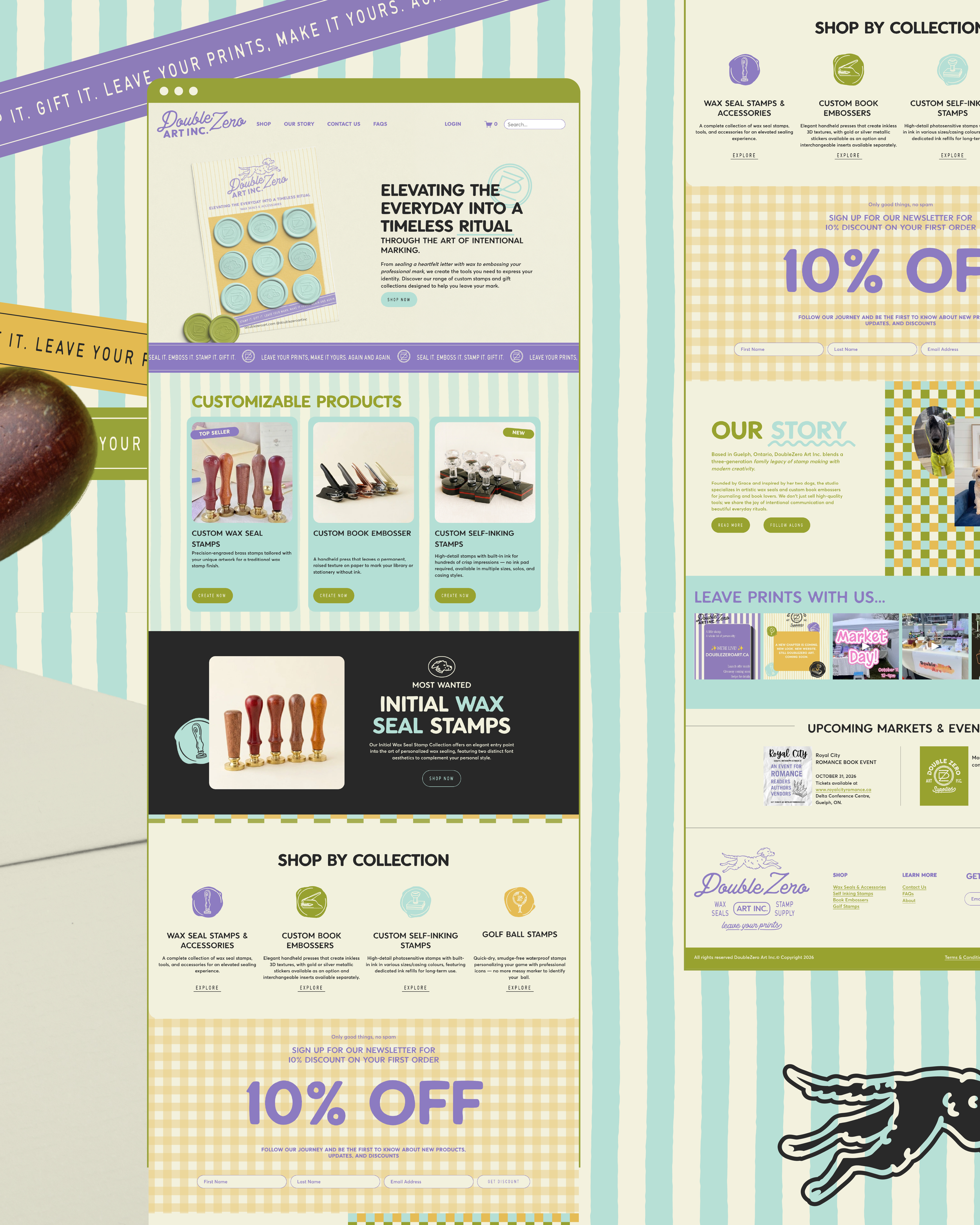
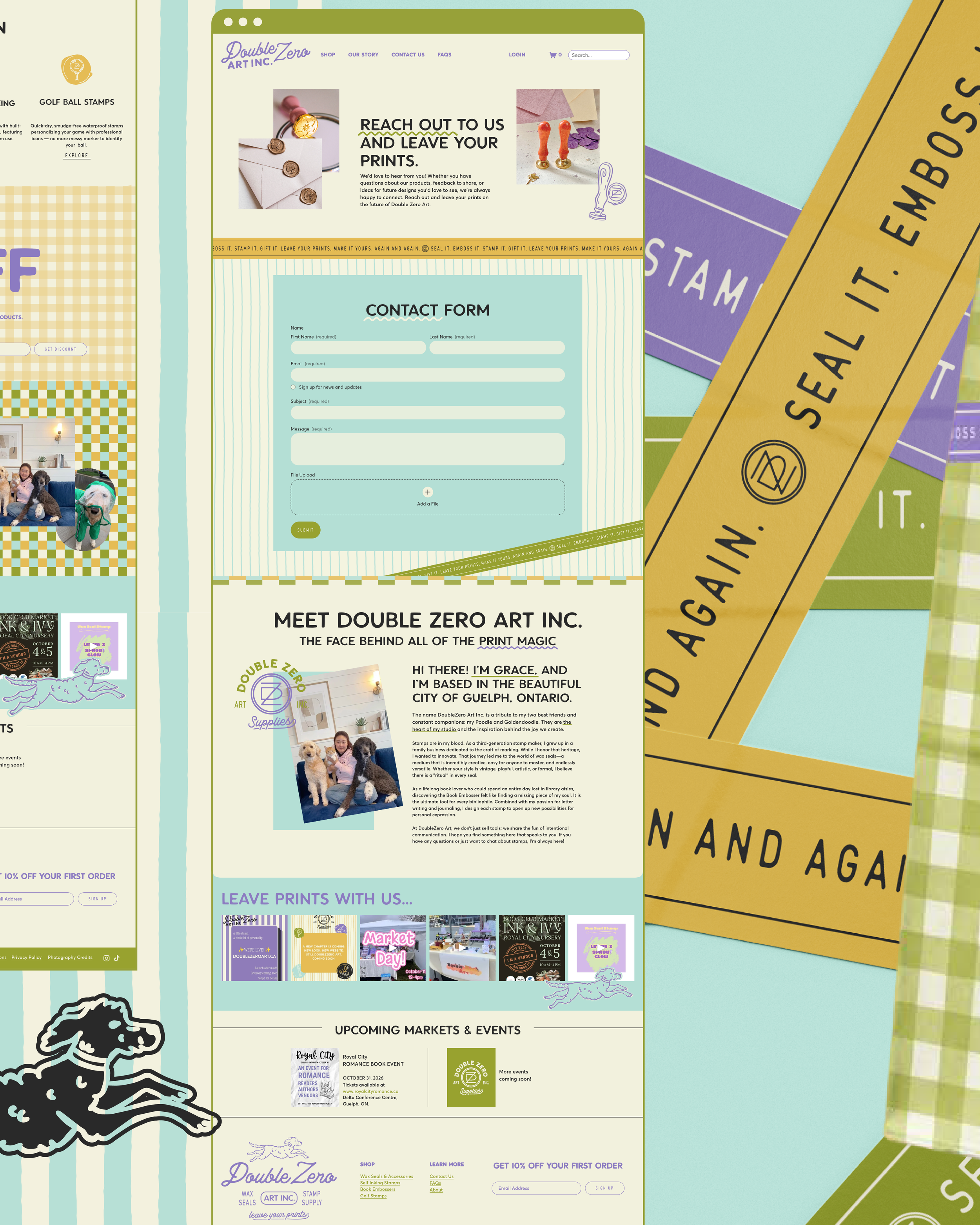
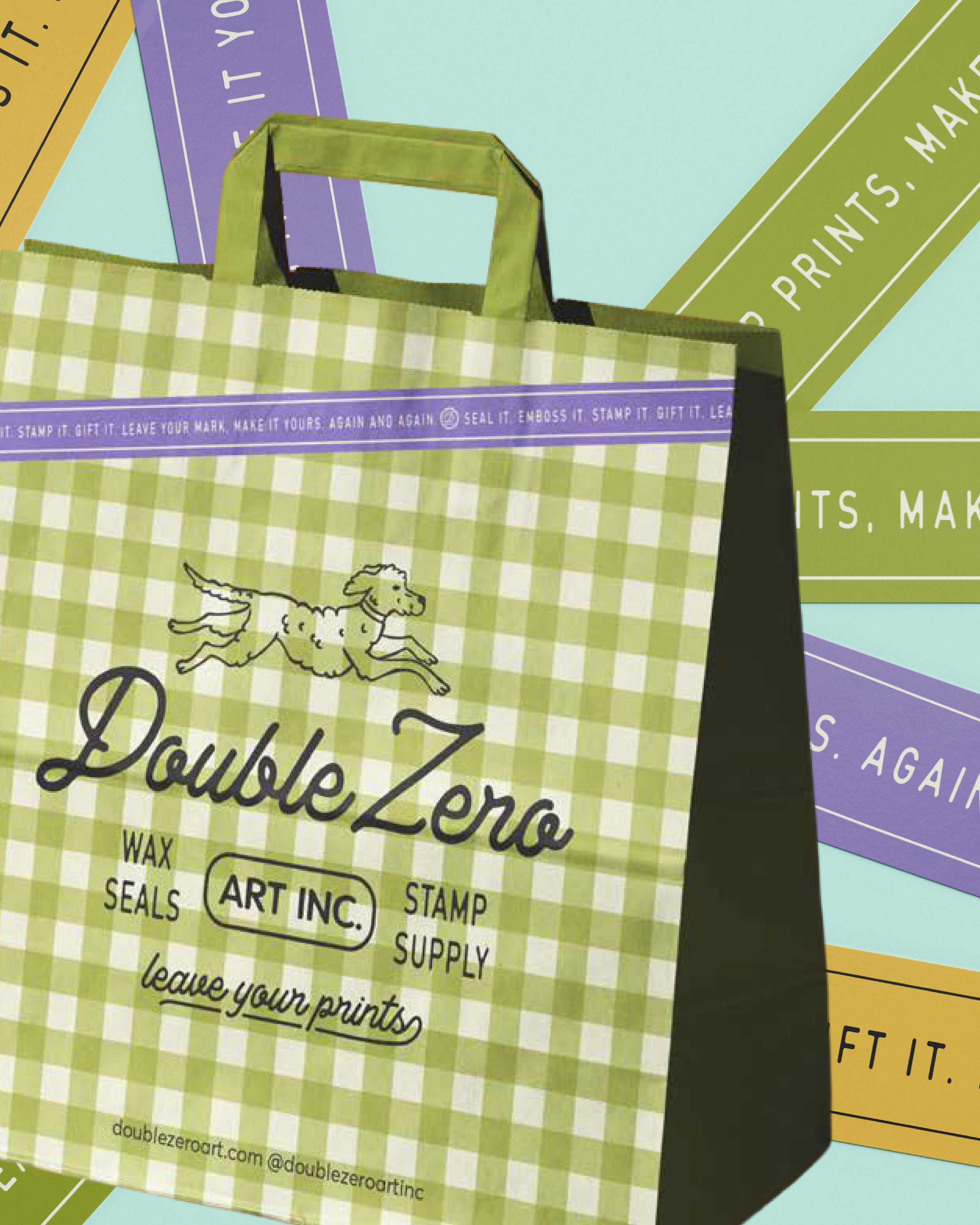
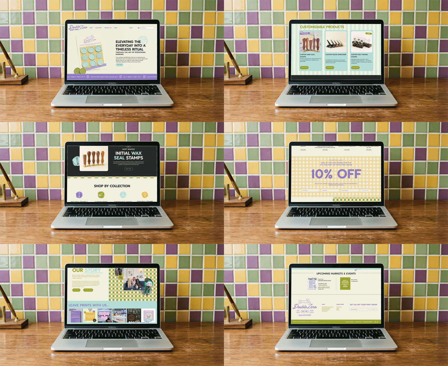
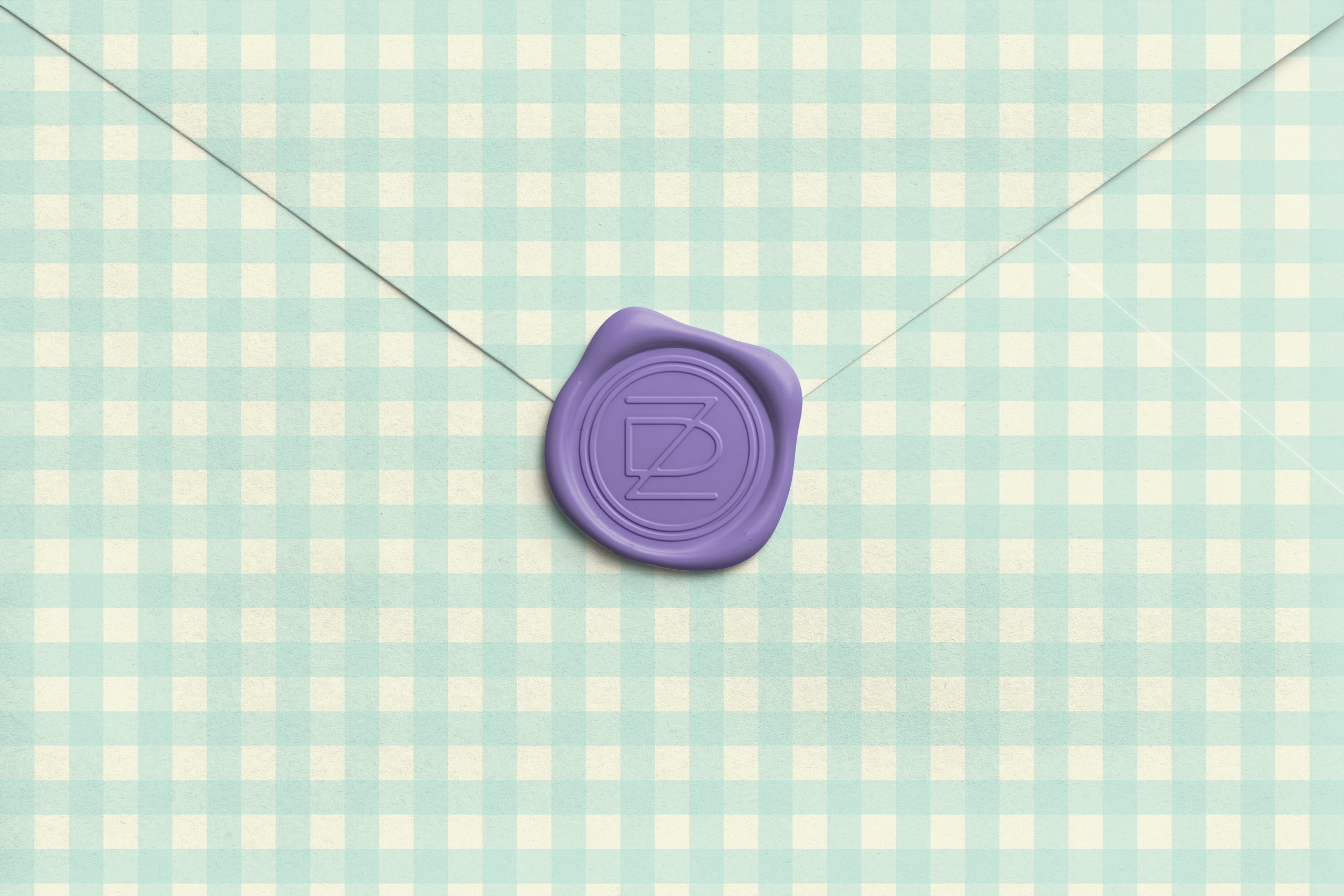
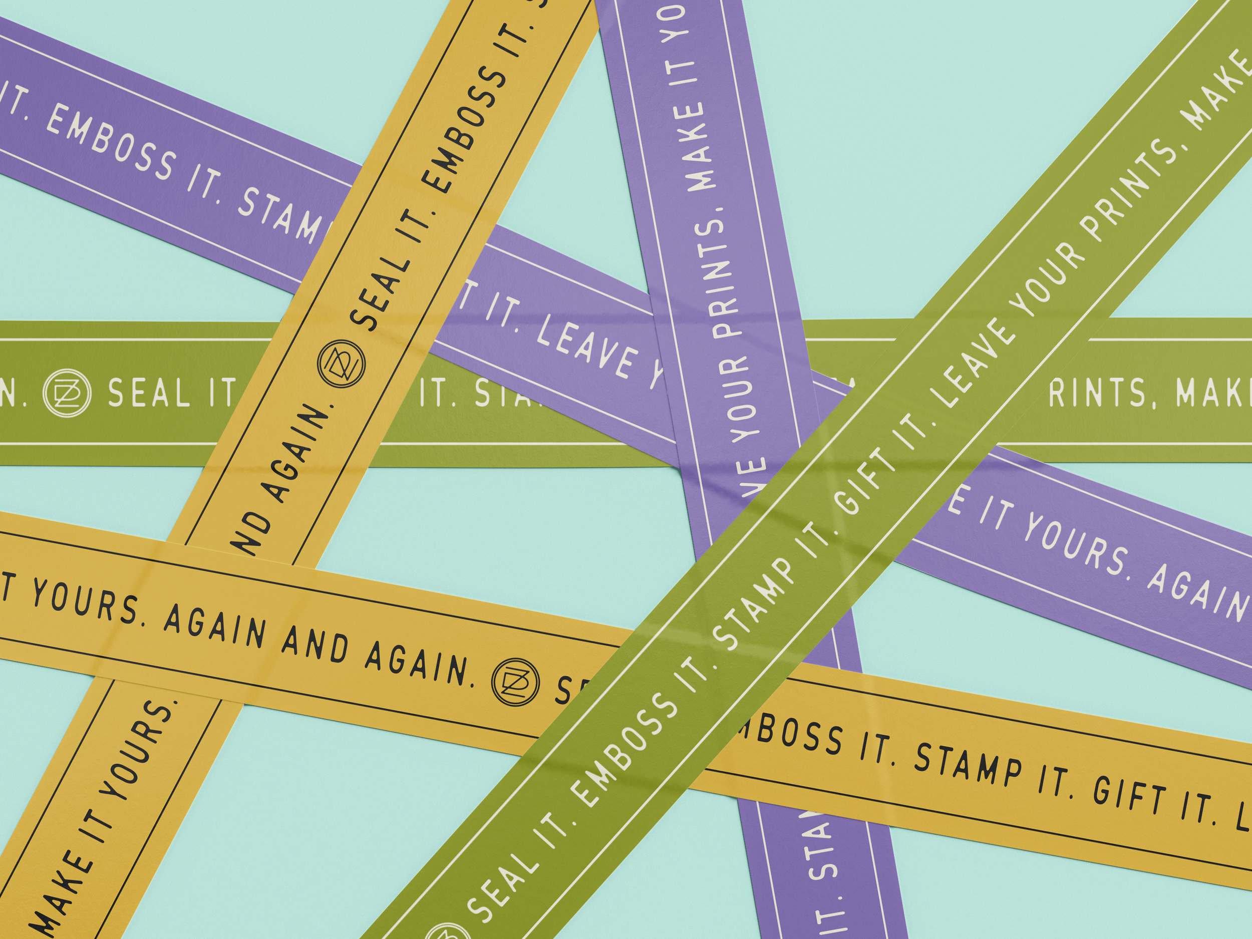
Her new brand system includes a letterpress-inspired primary logo with a classic illustrated poodle, a flexible suite of stacked, circular, horizontal and filled logo versions, a D and Z monogram, and “stamped” variations that look pressed by hand. We supported it with custom iconography for her core product categories, heritage-inspired stripe and gingham patterns, manifesto tape graphics, and a lavender-led colour palette grounded in muted greens, creams and soft blacks, all tied together by her new tagline, “Leave your prints.” We also designed a bespoke Squarespace website with a full shop, custom from top to bottom. It uses every one of her brand assets and is full of whimsy, giving her a polished, easy-to-shop home for her work. The result is a brand and digital space that look as professional as the work behind them, and set Double Zero apart in the world of handmade stamps and wax seals.
SERVICES DELIVERED:
QUICKIE BRAND WEBSITE ICONOGRAPHY PATTERNS
BRAND OVERVIEW
BRAND PERSONALITY
01.
Double Zero is warm, nostalgic, and playful, with deep roots in traditional stamp making and a love of the handmade. It feels like a cozy print shop with a loyal dog curled up nearby: classic, welcoming, and full of spirit. The brand reflects care, heritage, and whimsy all at once.
TARGET AUDIENCE
02.
Their audience is made up of thoughtful, detail-loving people who value meaningful touches over mass-produced ones. They’re couples planning weddings, small businesses looking to brand their packaging, and gift-givers searching for something personal that makes an impression (pun intended). They appreciate tradition, they notice the small things, and they want to buy from a maker who feels like a person, not a storefront.
Goals were to transform Double Zero from a cutesy, hard-to-use logo into a brand that feels professional, timeless, and true to their family’s legacy of stamp making. We aimed to help them stand out in a crowded wax seal and stamp market, building a flexible system that supports everything from custom orders to ready-made gifts. The custom website and expanded visual toolkit give them a polished home beyond marketplace listings, one that’s cohesive, easy to shop, and aligned with the quality of their work.
03.
BRAND GOALS


BRAND FEATURE REEL

A run down of all the pieces we created for Double Zero Art Inc. and how we showcased their special sauce: turning the every day into meaningful ritual.
FROM THE
MOUTHS
OF BABES.
CLIENT FEEDBACK

✹
I had a great experience working with Kendall on the branding and website! She was so patient with all my questions and changes, and always took the time to explain things and make sure everything felt right.
I really love how the branding and website turned out. She also made the handoff super easy with all the files and tutorials I needed to manage the website myself. Kendall was lovely to work with and I would definitely recommend her!
— GRACE ZANG, OWNER | Double Zero Art Inc.